


Bad Design Case Study: Lush
What better way is there to learn than to look at what you shouldn’t do?
Lush isn’t just a nice word for “borderline alcoholic,” it’s the name of a global company. Lush makes its millions selling juicy bath-stuffs, shampoos, lovely soaps, and “bath bombs” which splutter bubbles and foam and tasty smells when dropped into water.
The Set Up
Let me start off by saying that the Lush stores and products are pretty awesome.
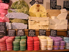
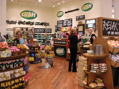
Lush sells girly stuff, but it doesn’t really have a delicate girly image—it’s kinda rawr-power-girly, personal, delicious, luscious (Lush), and fresh. The store designs mimic a hip greengrocers’ with faux handmade signs, lots of wood, and casual-looking but very calculated merchandising.
And it works.
Doesn’t that just make you want to buy? Or possibly just steal a bit and eat it?
Oh, and they are not cheap. Nooooo, sir. This is a place where you splurge on yourself. You’re talking $4 – 7 for a bar of soap.
And this is Lush’s logo:

It’s fairly transparent in terms of its designer’s rationale:
- It’s retro and poppy
- It’s round and citrusy, which are meant to make you think fresh, refreshing.
- The comic book style lettering is in-your-face, like Lush is going to save the day.
It doesn’t really fit with their in-store design but that’s OK; they make it work.
Next Up: Don’t Cover Your Eyes
So you’ve met the store and the logo, setting the stage for… the web site!?
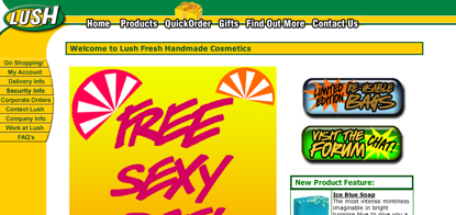
Remind you of the store at all?
This is the design that spurred me to write this post. Turns out it’s not the Lush site, but one of many. Lush.com itself is just a (very ugly) gateway to all the local distributors in each country where Lush stores exist. Each local distributor gets to design its own web site; the designs range from horrendous to merely bad.
The Aussie one pictured above is one of the least objectionable. (See it in all its glory.)
From my internet escapades, it seems like almost all of the physical stores look pretty much alike, including US, Canada, and European locations (Lush started in the UK).
Oh No You Din’t
The people behind this web site design have taken something that is an indulgent way to take care of your body and turned it into a web site that looks like it should be selling athletic cups. With, perhaps, the exception of the “Free Sexy…” bit.
And, those colors, ugh. Green and yellow? In those shades? In moderation, please! And their own banner ad on the front page is blindingly contrasty with the yellows, pinks, and fuschias.
Specific Pitfalls:
- Industrial yellow-orange and darkish green; they may be from the logo, but there’s probably a reason the store fronts aren’t decked out in those colors
- Generally speaking, all the colors are far too saturated and contrasty
- Black outlines and shadows do not bring to mind calming, envigorating “me time”
- The sidebar and header design are very constrained and blocky (the little bump out of the menu does nothing to offset this)
Branding Problems:
- There are no echoes of the store’s color schemes, or even the color schemes of the products themselves
- There’s nothing at all to remind visitors of the airy elements of the store
- “Luscious” and “fresh” and “indulgent” are really not going to come to mind (remember: jock straps)
Potential Solutions
It’s not easy to take a bright, pop-style logo like that and reconcile it with the informal, almost earthy style and atmosphere of the stores where Lush actually peddles its goods. But it’s also not impossible. The stores make it work… how could these people make the web sites work?
This is what I would do:
- Design a new color palette for the site that includes a set of warm tans and browns—to mimic the the wood, and color of many of the soap products (which range from white to golden).
- The rest of the color palette would be sampled from some of the products’ colors, including blues, greens, and pinks.
- Set the logo on a white background and offer some sort of color or graphical link between the white area to the actual store front below (not a lot of calm colors go well with bright yellow and green)
- Set all the products on white, with isolated photographs (the products on white backgrounds); consider making the front page a photo of the luscious product merchandising seen in the stores, and when picturing the products, group them together artfully, rather than just one piece
- Echo the store’s signage with a dark slate or dark brown color (not black) and white text announcing special deals and/or product names
Putting my money (or at least my mental CPU cycles) where my mouth is, I took ~10 minutes and came up with this:
My suggestions (and little design example) won’t instantly solve the web site’s problem, but they’re starting points… and, I like to think, a good example of the kinds of things you can use to solve your own difficult design problems.
The Key Lesson…
Just because you use the logo’s colors doesn’t mean your site is properly branded!
You have to keep in mind your brand’s image and all other collateral (including physical things like your stores or offices!) that are used to tell the world your brand’s story.
In other words, you can’t lure people in with the promise of sensual self-care and then hit them over the head with traffic light yellow.
Well, I suppose we’ve seen today that you actually can, but it’s not good for business.
Random Crafty-Girly Knowledge: Bath bombs are basically citric acid in powder form, plus sodium bicarbonate—yes, baking soda—and a little bit of liquid binder, often witch hazel (an astringent made from a plant extract). Plus other goodies to make the color and smell. I’ve made ‘em for presents before. They’re always fun… if you like baths.
Was it good for you, too?
Lemme know! I’m awaiting your input with bated breath.


Amy,
Thanks for the case study. As a non-designer, I often see that stuff doesn’t look right but can’t quite pinpoint why or how. This was helpful.
luke
BTW, as a former resident of Australia, the green and gold shades are Australia’s national colors (red, white and blue were taken already). That doesn’t excuse their use on the site, but might explain it some.
I absolutely agree with the write up of the design shown. But, although I also agree with the specific solution offered, I don’t think it fully solves their problem.
As mentioned, Lush is a portal that provides a gateway to many local lush stores, each with their own page. (That is correct, right?) So maybe a better solution would be (everything you wrote plus) designing a resources bundle for lush to offer/require of the local shops. Including a color palette, sample logos, a sample site as reference, and some guidelines about whitespace, content, and other aspects of presentation.
How would you tackle a project like that? I can talk it up but I doubt I could do it!
Again I don’t find fault at all: I really like the deisgn sensabilities you seem to take naturally. I’m just looking at the scope of the problem…
@Luke – Ahh. It might explain why they chose to emphasize it (in poor taste) 🙂 Lush itself was founded in the UK so the green and yellow identity originally was (presumably) not founded on the Aussie flag, though 🙂
@ Robbie – You’re absolutely right. And they must do something similar with the stores themselves, because the stores in the UK, Canada, America, and probably the rest of Europe (at least that I can verify) look pretty much the same. They just don’t do the same for web sites, probably because the official site is so terrible to start with!
As for how I’d do it… well, it’s my experience that if you don’t know how to do something, doing is the best way to learn! (For design and programming and playing music and so on — not, say, medicine or law, without supervision 🙂
I’d probably draw up a PDF with color palettes and their RGB/Pantone numbers, font choices, and so on, and just hand that out. (In addition to an HTML template or something for the site itself).
Although there needs to be some consideration for the difference of cultures — the Hong Kong site, for example, is brutally red, but in China, red is the most prosperous and lucky color. So it may be garish, but also appropriate…
Really, it’s amazing how freeform they are. 🙂
(I know, not much of an aswer, huh?!)
Their printed materials are slightly more true to form, in the style of a local newspaper. Maybe if the print designers were given a go at the website they could come up with something more coherent.
Long time reader, first time commenter 🙂
These articles are amazing Amy – its great to see a bad design (and all the reasons why it is so) and watch you turn it around.
I hope there will be more!
As I troll the internet looking at sites, and comparing them to the product the sell (or the brick and mortal portals that they sell their products at), I see this type of mixed message branding all the time. Some companies get the concept of consistent brand across all medium, but many do not. Most of the big stores (especially those you find in a mega-mall) have good use of design. But when you are dealing with a smaller company that can’t afford the big-dollar ad/brand agencies, you get a bunch of good ideas, and then something that is an afterthought. Looking at the Lush site, it’s clear it was an afterthought.
One of my favorite examples of a small company that does the brand consistency very well is Moosejaw.com. These guys from Michigan have a brilliantly designed site, and their catalog, stores, and advertisements all are extremely consistent (and well done).
Thanks for the review Amy!
Nice review Amy! Fun read.
I don’t care much for the ‘LUSH’ logo anyway to be honest, I think they could sort that out too when they finally get around to fixing their site.
All the best Rich
I have to agree with you, the Lush stores are lovely (and pretty much the same in whatever part of the world you’re in, but the website is horrendous. Also it doesn’t help when you’re trying to look up something on their site and half way through it just stops responding.
Lush is what a cosmetics company would look like if it were run by a 14 year old girl.