


Drop That Design! 6 Things You Need to Know About Color
Certain color combinations can make your eyes water, others can make your eyes practically leap out of their sockets in delight. Colors can help instill confidence in a product, company, or design—or undermine it. Color can set the mood, or destroy it. Color can make you fit in, or stand out—and it depends on your situation whether or not that’s a good thing.
Despite the seemingly magical power of color, it’s not voodoo. No chickens need die in your pursuit of color-coordinating bliss—it’s a skill that can be developed in anyone who has the ability to see the rainbow.
Annoying Prologue
I’ve long been meaning to write an article about color but I wasn’t truly galvanized until a friend sent me this article. I got the feeling that the article had made the rounds—and I couldn’t stand on the sidelines while misinformation like this gets passed into common knowledge of developers, hungry for some help for their color problems. (And his theories on picking colors have inspired my #1 tip at the bottom.)
Now, I don’t want to disparage the author’s intentions at all, because I’m sure they were good—after all, it’s not like there’s a designer superhero who swoops in to save the day for people forced, against their will, to choose colors. Unfortunately, you know what they say about good intentions. On the upside, it helped me formulate this list to try and dispel some color myths and misunderstandings.
So, without further ado or introduction… May you color in peace! (And good taste.)
6. Make your colors earn their keep.
It’s too easy to just spot a color you love and then use it on the next available victi—I mean, project. Unfortunately, this isn’t the path to the most effective work—and color picking, like all design work, is supposed to be functional as well as beautiful.
So, when you pick your colors, you should always ask yourself, “What result am I trying to achieve?” All color choices should stem from your answer.
Examples: If you’re trying to hint at delicious food, consider the type of food and the colors associated with it. (Neon green, for example, is probably not a good choice.) If you’re trying to stress stability and capability, check out which colors are associated with those ideas. (Fuschia? Doubtful.) If you want to go for cool and hip, figure out what stuff around you exudes that feeling and why. If you want to really stand out from the competition, zig when they zag.
5. Pretty is nice, usable is nicer.
Usability goes along with fulfilling your true purpose. After all, what good are your pretty colors if people can’t read your design?
Be sure to create a good contrast between background color and text, and double-check that your colors aren’t so bright as to cause eye-watering or after images.
And, if you use color to encode meaning (e.g. click this, not that, or this is bad, that’s good), make sure that it’s still usable by people with various types of color-blindness.
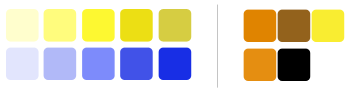
The author of the aforementioned article uses these graphs as an example of the “fairly appealing” results of his work to spiff up his color palettes. As you can see, the colors only serve to distract from the actual content:
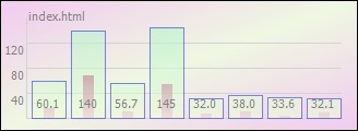
Too many colors can easily spoil a design’s ability to communicate. (And, to be honest, this graph doesn’t even know what it’s trying to communicate, but that’s another article entirely.)
4. Just because you don’t want to claw your eyes out… doesn’t mean you shouldn’t.
One of the most dangerous misunderstandings in the aforementioned, misguided article is found in the middle of the last paragraph on the first page:
This is why most walls are painted light colors: they’re easy on the eyes, and they don’t clash with anything. This is also why many websites use pastel color schemes: Any light color with a moderate saturation goes with any other light color with a moderate saturation.
— The Article
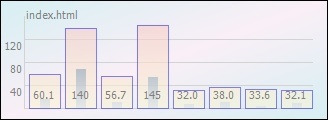
This is not true! The rules of color matching don’t apply selectively to only saturated colors. If you need further proof of this, just look at that graph again:
In reality, you don’t necessarily have a match because just because your low-saturation colors don’t cause the eye-watering and discomfort high-saturation clashes do.
The author of the article was probably thinking of what interior decorators call “neutrals,” which include white, off-white, grey, tan or beige, and even “dusky” (low-saturation, greyish) green. But that’s interior design, not color science—combine those dusky green walls with a bright pink sofa and you’ll find that green is not so neutral after all.
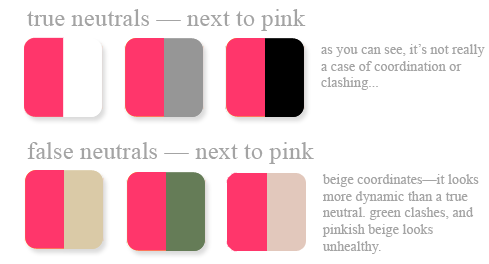
The only true neutrals are white, black, and (usually) grey; although pairing colors with these neutrals can change the dynamics of a design, they can’t clash. All other colors are subject to clashing, depending on what you pair them with.
3. Colors do so much more than “sit there and look pretty”
There are three main ways your choice of color affects people:
Colors carry emotional and metaphorical meaning for everyone who looks at them—and allegedly, in some cases, directly influence human behavior.
For example, certain shades of blue are said to convey stability, and others are said to convey calm. Some shades of yellow make people think of sunshine, springtime, and hope; others make people think about dangers, warnings, and the unhealthy hue of some bodily fluids. And don’t forget culture! Combinations of orange and black may say “Halloween,” while combinations of orange, brown, and yellow might say “The 70’s.” And you can’t just think of your own culture—to the Chinese, red means good luck and good fortune, and it’s the color of wedding dresses (and just about everything else), whereas red typically means fire/vigor, sensuality, or power to Westerners. And so on.
Research has also indicated that the application of colors can create or stifle appetite, make people hurry or calm down, and a host of other subtle effects. Or at least, that’s the idea behind the pale pink and pale green decor in hospitals, and the reds, yellows, and orange-browns of many fast food joints.
Saturation and brightness convey a more generalized kind of message—less “touchy feely,” but equally important.
It’s not just the hue you choose, but the saturation and brightness, too—whether it’s a light color or a dark color, with a lot of color intensity or without much at all.
Bright, pure colors seem “fresh” and crisp; pastels are often considered calming, or comforting; saturated dark colors may feel “solid” and heavy while unsaturated ones can seem sophisticated and refined, or wishy-washy, watered down, even dismal.
The combination of colors affects the overall “feel” of the final result.
When you combine colors, you create a dynamic that wasn’t there with a single color alone—in effect, the combination changes the effect of all the colors in it.

You can choose to create harmony by choosing colors that coordinate according to color theory, or create tension and drama by choosing colors which clash subtly or strongly. (Just like musicians use discord in music. And just like in music, if you’re inexperienced in the art, you shouldn’t try to create drama by mixing up bad combos. Learn the rules before you break ’em.)
Hey there, new reader! This is the first in a series of articles on color, human interface, and other such related goodies. Subscribe for more! Or, get updated by email when new posts are made.
2. Relying on software to pick colors for you is like letting your mother pick your clothes.
Using some basic knowledge picked up by Googling, you can probably come up with some passable color schemes, given either a color wheel and a ruler, or a simple software program.
BUT… would these color combinations be appropriate for your task? Effective? Beautiful? Might they still be too bright or too dark to be human-friendly?
Software and math can’t understand your wishes, hopes, and goals, or your viewers’ emotional or cultural baggage—or even vet the colors with a critical human eye. It’s simply a toss-up.
Like this article? You might also enjoy my presentations on user interface and user experience from OSCON ’06.
1. The proof of the pudding is in the eating.
And so we come to our final “Thing to Know” about color. This one’s not directly about color itself, but rather the learning process.
Put simply: Don’t take anyone’s advice about colors until you see their output—and don’t listen to them if it’s ugly. In the case of Jon Shemitz, author of the aforementioned misguided article, that means this:
If that were pudding, it’d make you very sorry indeed that you ate it (although you might be able to call in sick to work).
Thankfully, unlike many things, a person’s color-picking prowess can easily be assessed. It is both A) something visible, and B) something most humans have an innate sense for. (Even if you feel paralyzed when you pick your own, you probably have no real problem judging color palettes that are already out there. It’s a human thing.)
Bonus Round: Yay, links!
All psyched up about color? I know I am! Don’t quit learning now, just because I’m out of breath (and my wrists hurt!). Here’s some recommended reading so you can keep on:
- Poynter.org – Color, Contrast, and Dimension in Newspaper Design — you will learn. Ignore the fact that it’s about newspapers.
- handprint.org – Color Vision — from a painting enthusiast (and, yet again, still applicable)
- Behr Color Smart — yes, another non-web-specific resource! But color is color. And this is a neat Flash-based app.
- Natural Selections: Colors Found in Nature and Interface Design — article talking about one way to help ensure your audience doesn’t gouge out their own eyes
Books you might find useful—at a reasonable price:
Books you might find useful if you have a largeish book budget:
Didja like it? Help get the word out—digg it!
Bonus Round 2: You!
Let me know what you think! I want to hear from you. What did you find helpful in this article? What would you like to see next? Have any terrible or funny color stories to relate? (You know you want to.)


7 Hire a designer to do some color ninjistics for you
This is exactly the kind of thing I want to see out of Slash7.
#8 might be that KISS works for creating a color palette as well as it does in programming an app. Keep it simple on the number of colors in your site (or data you’re trying to display!) to keep from overwhelming folks. Also, be consistent with how you use those colors.
Great article, can’t wait for more. I need all the help I can get to take my designs from "fugly" to "ehh" to "sexy time".
The Coloroid System (http://www.colorsystem.com/projekte/engl/52cole.htm) is a really nice way to work with colors. With this application (http://www.flexinform.com/) it’s really easy find harmonic color designs. Kuler (http://kuler.adobe.com/) is ok too.
Fantastic article, Amy! Color can be a very daunting challenge, and I’ve long looked for some resources in learning how to deal with it.
Keep ’em coming!
Nice write-up…
But in regards to the article that set you off, what do you expect from a microsoft/visual-studio badged site? Really, are the best designers spending their time writing articles for that crowd? 🙂
Glad you’re enjoying it, guys!
pk, I’m definitely going to get into online tools at a later date. Right now I don’t want to be one of those people who goes "I’m going to teach you about color!" and then just pushes people off onto a tool. Thanks for the links — I’d never heard of Coloroid before. 🙂
Seth, I knew somebody was going to point that out. Well, what do I expect? I expect them not to act like they know what they’re doing, when they don’t. That’s all 🙂
I enjoyed the article, Amy. It deserved the del.icio.us bookmark. However, at the risk of sounding like a jerk, I have 2 problems: 1) I prefer to get the whole article in my Google Reader, although I could have looked past that if not for 2) the "Hey, isn’t this great? Subscribe!!" , "Digg this article!", etc. boxes. Personally, I think if it deserves a digg, or some other such thing, it will get it without you placing the link (especially the demographic you are typically targeting). … I’ll shut up now. Sorry. Good article!
Hi Miles, I totally understand what you’re saying. At the same time, I am trying to make the site more beneficial for everyone. I noticed recently that a large number of my articles are both entrance and exit points for new people — and to that end, I’m trying to share the other content I have that’s related, persuade them to subscribe, etc. Not just for me — it’s not like I make money off page views or even feature ads. And I don’t think I will ever place ads on Slash7.
As for the digg links, well, I want to get dugg more to combat some of the terrible bad design advice that gets up there than for any other reason. I feel like a world where fewer developers make bad color choices is a world that will be happier for all of us. It’s not like I made a crappy "here’s 10 sentences and I’ll pretend you can learn 10 things from it!" article like so many do. At least, that’s my justification. 🙂
But I’ll see if I can do it in a way that doesn’t annoy all my current readers. 🙂
Thank you for this awesome article Amy. I’m going to improve my designer skill following your suggestions 🙂
Hi Amy, I’ve been a rails developer now for what would be in the rails world quite a long time,
OldDeveloper.find_first("name =" + @params[‘me’]) <– see what I mean? 😉
well, okay it’s only been a couple years, but lately I’ve found that as much as I continue to be in love with Rails, I’m finding now that I actually have more curiosity about design rather than programming (this is due in large part to rails satisfying my programming curiousity). Being that you’re much more active in the rails community than I am have you met any programmers that have managed to crossover into the world of design and be just as good with Xhtml/CSS and Usability/Aesthetics as they are with programming rails? Does this ever happen? Or is it just too much for one person to be able to handle?
Because it seems like you’ve got a bug for the design thing too, and I would hazard a guess you’re not alone….
Amy, I was about to criticize you for the harsh, almost sarcastic tone of your reaction to the Shemitz article, but luckily I went off to read the article first. I think it deserves even more sarcasm. I first thought he was focusing on the how-to of rendering colors chosen by a designer — but (non-linear as I am) I then read his introduction. No, he’s talking about what a developer should do without the aid of an arty designer. So Microsoft.
Good article, would be really interesting if you could talk us through a case study or something that shows how to put your theory into practice.
This is a really good article. One I will probably have to read quite a few times to get to a point where I really understand it all.
I always find it funny and disturbing when really ugly sites that are hard to navigate talk about usability or design. Fun stuff.
Thanks!
Tim, sure, I think you can do it. Do I know anyone who’s done it? Hmm. Well I went the other way, learning programming after being a designer for years. I had to start from almost no real understanding of programming other than the idea of variables and input (thanks, BASIC!).
I think the trick is that you have to really, really spend a lot of time on it. I got where I am today by spending thousands of hours at it. I’m not convinced I have innate artistic talent, I just like to dissect things and figure out how they work.
For some reason, smart people tend to forget how long it takes to master something, and just assume that if it looks easy, it must be easy… and it’s not easy for them. Well, that’s an article for another day maybe 🙂
Gary, I will definitely be doing that sort of thing soon. There’s so much to talk about and show, you better believe it’s coming…
George, yeah, that’s always a laugh-or-cry situation 🙂
Great article. Excellent in writing!
[…] go-to when people working with Rails needed a designer who “got it.” Example, example, example, […]